http://www.youtube.com/watch?v=6LQz-4HfkV4&feature=PlayList&p=BAEE8CF4C5C31557&playnext_from=PL&index=0&playnext=1
http://www.youtube.com/watch?v=fl8zXEcUts0
http://www.youtube.com/watch?v=B2Asftg0rvg&NR=1
http://www.youtube.com/watch?v=4auzSBL3GVs&feature=related
http://www.youtube.com/watch?v=spA6-IWEYLI&feature=related
Wednesday, 12 May 2010
Monday, 19 April 2010
Moving Type
http://www.youtube.com/watch?v=WVFYSShWFnM
This Typography is based on a clip taken from Kill Bill By Lucy Lui. I think it is a very interesting and effective way of using text within a clip. I love the way the text just shouts at you, mimicking the words. The actual speach doesnt really need to be played in the backround because the type is almost effective enough
http://www.youtube.com/watch?v=7oVDkFe5wvE
This is a clip based on the Film American Beauty. I decided that i am going to make something hand written and so this may be an effective way of doing so...if it is possible. I will try it out and see.
http://www.youtube.com/watch?v=qKiJDSCUiNY&feature=related This is the Idea of writing text but the text is actually computer generated. Although the idea if this is pretty good.
Another idea i have would be to have individual words and letters cut out and move them around to make more words or sentances.
Thursday, 1 April 2010
Moving Image I have looked at
Here are some links to some Moving Image Clips that I found quite Interesting, sorry that they are links but i have no idea how to save videos from the internet to upload them lol.
http://vimeo.com/8330082 This is a RUN DMC 'My Adidas music video' Its quite funky and makes good use of Typography
http://www.youtube.com/watch?v=vxINMuOgAu8 This is the opening credits for a television series that I like, True Blood. It is very effective and the music used is very suitable to the feel of the series.
http://www.youtube.com/watch?v=SEZK7mJoPLY This is the opening credits from a film called SE7EN starring Brad Pitt. This is very visually effective and make excellent use of camera angles and cinematography. The
http://vimeo.com/3878375 This is the opening credits for a film called ED WOOD. Have a look at this, I really like it.
http://www.youtube.com/watch?v=DozfGxSOh4c This is the opening credits for a series I lovee. DESPERATE HOUSEWIVES. I think that it is very creative.
I would love to attempt to make something like the opening credits for ED WOOD and DESPERATE HOUSEWIVES. I think that they are very creative and artistic, although im not sure there easily made, but I'l mess around and see what i can do.
Thursday, 11 March 2010
Typography to wear
Typography to wear
Tuesday, 2 March 2010
Origional Images used for my Magazine Spread
Thursday, 25 February 2010
Magazine Spread


My Magazine Cover Idea.
I want the cover to be a mixture of photography, typography and hand drawing. I want it to look quite playful and fresh. I have came up with this sort of thing. You can see the typography at the side and the title. The Photography dominates the page but because their is so much going on it appears quite subtle.
 Although the first one is quite nice, I don't really know if it looks like a cover or an inside spread so i messed around with another image and heres what i got. I actually think it is more effective even though the use of typography isnt extensive. I thought i could maybe keep the Typography for the inside spread as I think it would allow me more freedom.
I played around witht the left hand side of the spread and came up with two ideas. Im kind of unsure to which one i will use.

Wednesday, 24 February 2010
I decided to experiment with typography using markers. I think this may be incorporated into my magazine spread.
 I just basically messed around with letters and colours in my name and this is what i came up with. I think it wis quite visually effective. The Word at the bottom is typography. I just mixed the letters around.
This is my name Maureen Erin Connolly with the letters mixed around.
 I just basically messed around with letters and colours in my name and this is what i came up with. I think it wis quite visually effective. The Word at the bottom is typography. I just mixed the letters around.
This is my name Maureen Erin Connolly with the letters mixed around.
Tuesday, 23 February 2010
Wednesday, 3 February 2010
Work with lighting, space and model making (Interior Design HECert)
Here are some photographs of previous work ive done with Light and Space, Model making and Editing on photoshop. I did these in relation to a course ive done in interior design.
This is the florr plan i used when designing an exhibition in the Ormeau Baths for Newon And Windsor. It was to exhibit their range of paints.
 After coming up with a pile of designs I decided to use this one. It showed the ranges of paints and the textures and ways in which they could be used. The centre peice was a pile of balloons hanging from the ceiling over a huge class of water, where people could come and burst the balloons watching them drip into the water to give a nice effect. This image shows various lighting effects which could be used.
 This is another view of the model.
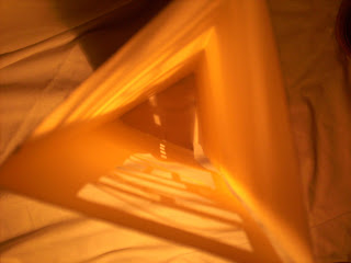
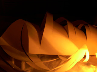
This was an experimentation with paper and lighting. It shows how light can be manipulated and how important it can be in a space.
These are photographs of a model I had made for the interior of an umbrella shop. I wanted to make it very angular, with most of the light coming from the glass roof and front window, giving the effect that the oversized umbrellas were shading those inside from the weather outside. 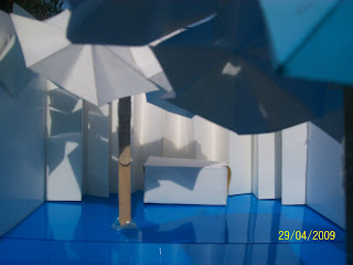
 This Image was edited using photoshop and people added to show how the shop could be used and make it seem more realistic.
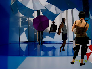

 This Image was edited using photoshop and people added to show how the shop could be used and make it seem more realistic.
Typography
Typography
Typography is the art of arranging a type, type design and modifying type glyphs.
Here are some typography designs I like:

I tried out Typography Techniques using photoshop and free hand. This is my Photoshop attempt.

Subscribe to:
Comments (Atom)


